Home /
Expert Answers /
Finance /
11-changes-to-the-security-market-line-the-following-graph-plots-the-current-security-market-li-pa803
(Solved): 11. Changes to the security market line The following graph plots the current security market li ...
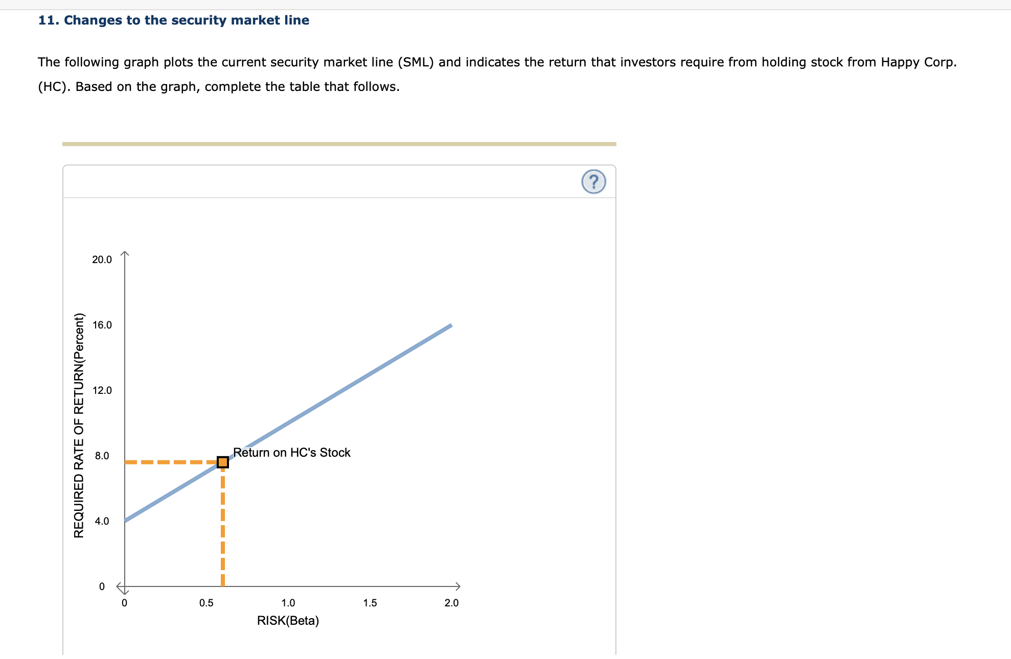
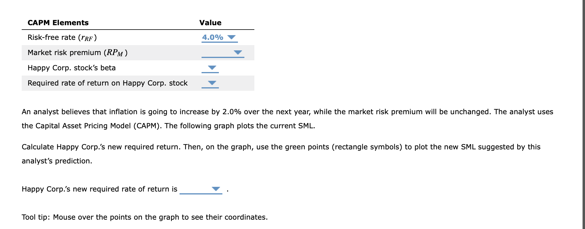
11. Changes to the security market line The following graph plots the current security market line (SML) and indicates the return that investors require from holding stock from Happy Corp. . Based on the graph, complete the table that follows.
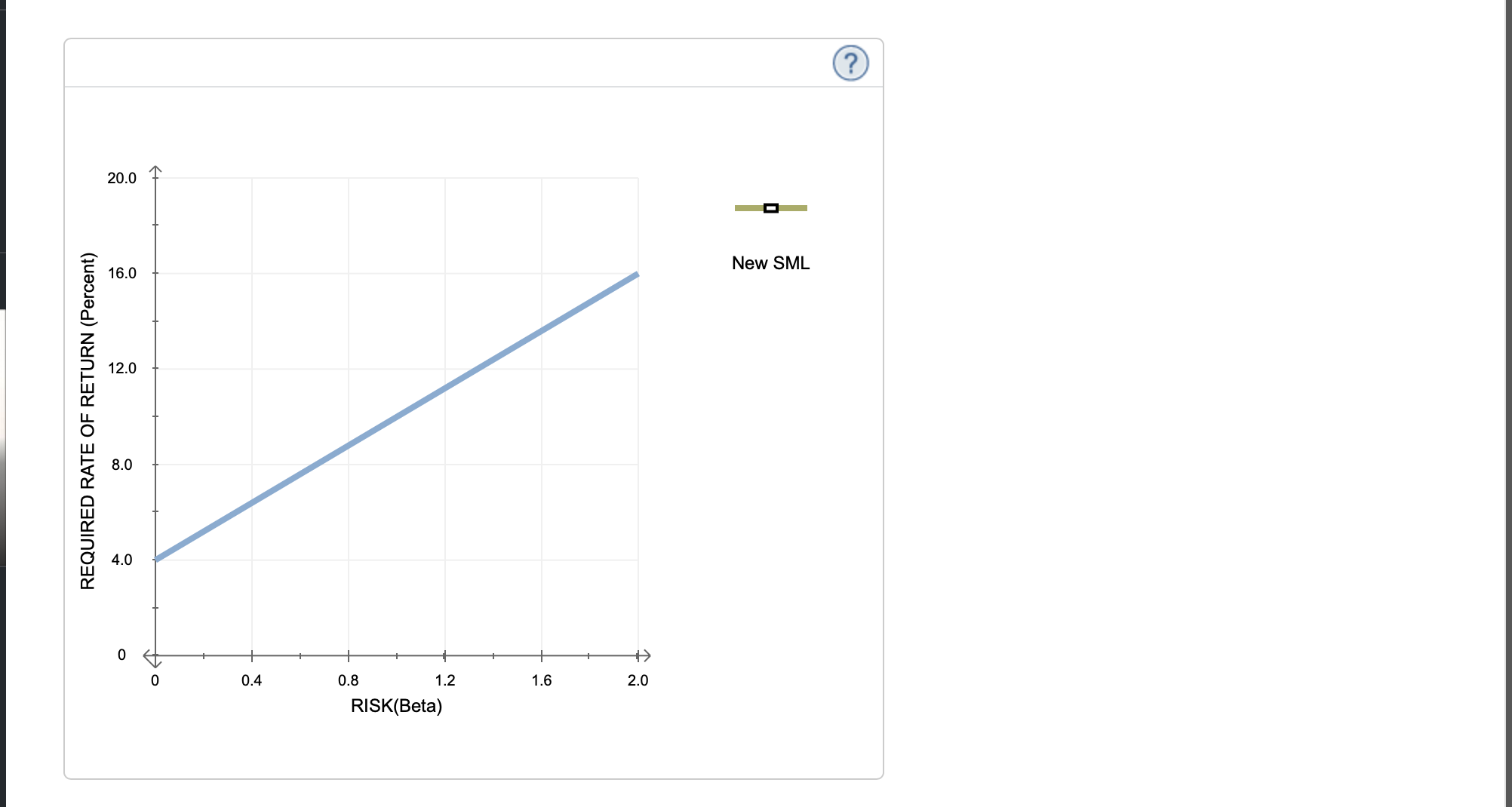
An analyst believes that inflation is going to increase by over the next year, while the market risk premium will be unchanged. The analyst uses the Capital Asset Pricing Model (CAPM). The following graph plots the current SML. Calculate Happy Corp.'s new required return. Then, on the graph, use the green points (rectangle symbols) to plot the new SML suggested by this analyst's prediction. Happy Corp.'s new required rate of return is Tool tip: Mouse over the points on the graph to see their coordinates.
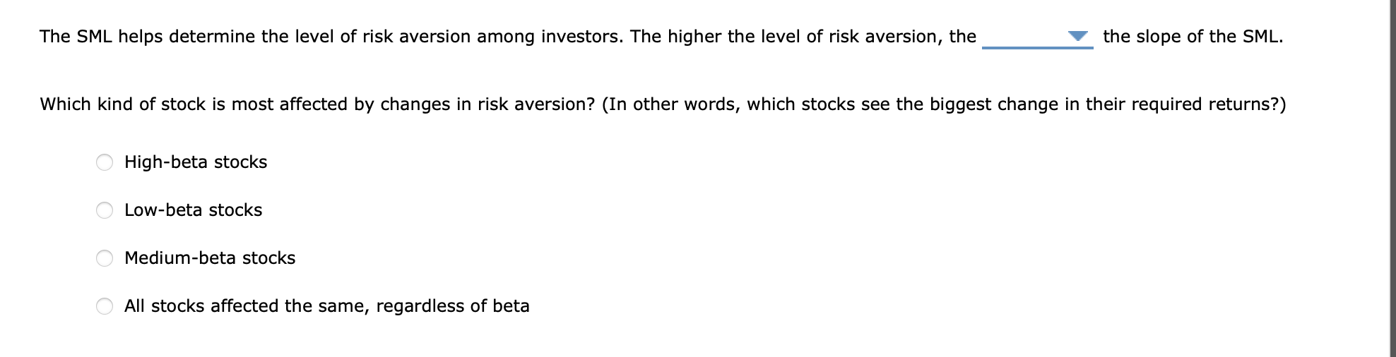
The SML helps determine the level of risk aversion among investors. The higher the level of risk aversion, the the slope of the SML. Which kind of stock is most affected by changes in risk aversion? (In other words, which stocks see the biggest change in their required returns?) High-beta stocks Low-beta stocks Medium-beta stocks All stocks affected the same, regardless of beta