Home /
Expert Answers /
Economics /
the-figure-below-presents-the-demand-curve-marginal-revenue-marginal-costs-and-average-total-cos-pa255
(Solved): The figure below presents the demand curve, marginal revenue, marginal costs, and average total cos ...
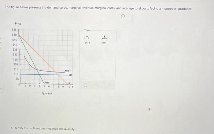
The figure below presents the demand curve, marginal revenue, marginal costs, and average total costs facing a monopolist producer, (1) \( \begin{array}{cc}\text { Tools } & \\ \cdots 9 & \\ \text { PLA } & \text { DWL }\end{array} \) a. Identify the profit-maximizing price and quantity.
a. Identify the profit-maximizing price and quantity. Instructions: Use the tool provided 'Pt. A' to plot the profit-maximizing price and quantity. b. Under monopoly pricing, profits are c. Under monopoly pricing, identify the deadweight loss, Instructions: Use the tool provided 'DWL' to lllustrate this area on the graph. Drag the points to move or resize. d. If government mandates pricing such that \( \mathrm{P}= \) ATC, profits will be Compared to monopoly pricing, deadweight loss will be e. If government mandates efficient pricing. profits will be Compared to monopoly pricing, deadweight loss under efflicient pricing will be Compared to a mandate where \( P= \) ATC, deadweight loss under efficient pricing will be t. Is this a natural monopoly?
Expert Answer
Answer. Below graph shows profit maximizing output and the Deadweight loss. a) Profit maximizing price = $30 Profit maximizing ou