Home /
Expert Answers /
Economics /
the-following-graph-shows-the-average-and-marginal-revenue-curves-for-a-monopolist-image-shows-pa728
(Solved): The following graph shows the average and marginal revenue curves for a monopolist: Image shows ...
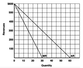
The following graph shows the average and marginal revenue curves for a monopolist: Image shows the bar graph which represents the curves of MR and AR. At x-axis shows the Quantity and at y-axis shows the Revenues in dollar. Refer to the graph above to answer this question. At what output is total revenue maximized? Multiple Choice 50. 40. 30. 60.
