Home /
Expert Answers /
Economics /
the-graph-on-the-right-shows-the-demand-marginal-revenue-marginal-cost-and-average-total-cost-cu-pa574
(Solved): The graph on the right shows the demand, marginal revenue, marginal cost, and average total cost cu ...
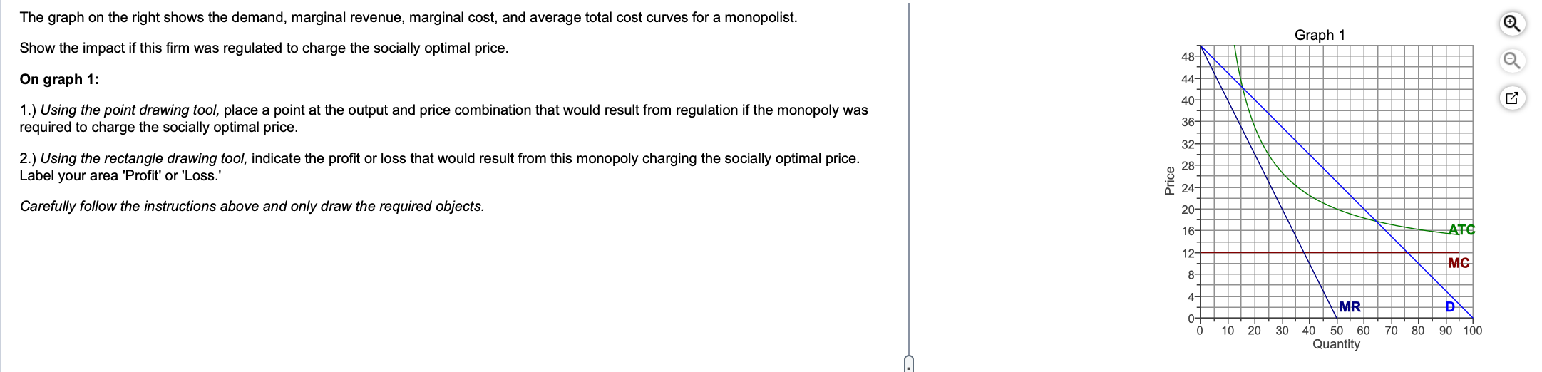
The graph on the right shows the demand, marginal revenue, marginal cost, and average total cost curves for a monopolist. Show the impact if this firm was regulated to charge the socially optimal price. On graph 1: 1.) Using the point drawing tool, place a point at the output and price combination that would result from regulation if the monopoly was required to charge the socially optimal price. 2.) Using the rectangle drawing tool, indicate the profit or loss that would result from this monopoly charging the socially optimal price. Label your area 'Profit' or 'Loss.' Carefully follow the instructions above and only draw the required objects.
Expert Answer
The point on the graph represents the output and price combination that would result from regulation if the monopoly was required to charge the socially optimal price. The socially optimal price is the price where marginal cost equals marginal benefi...